UI Elements
Scolvo Development Platform clients (Android app, iOS app and Webapp) are based on UI elements and user interactions. This page gives an overview on the usually used elements and their nature.
We describe in detail following UI element groups:
Menu system
Pages, page layouts
Lists
Buttons
Input fields and Labels
Popup windows
Notifications
Layout elements (Containers and Spacers)
Menu system
Every client application starts with the menu page - after a successful user login - where the authorized menu items are visible. The menu items drive the user workflows and let the logged-in user to use the feature set of the implemented application. The menu items can show a specific page or execute custom business logic. A menu item can have a text described in all supported language dictionary files with the same keys.
You can see more details in Menu API page or in Menu Structure lesson page.
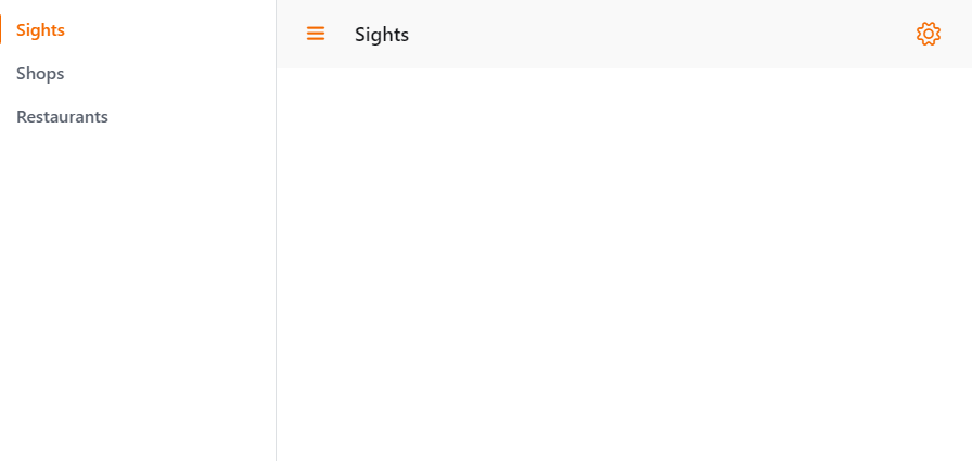
Example menu structure from Webapp client
In our example there are 3 menu items: Sights (defaults), Shops and Restaurants, where texts are defined for all menu items.
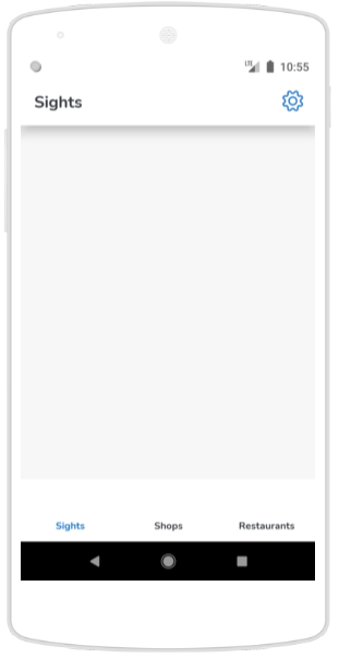
Example menu structure in mobile app
Using the same example the UI in the mobile app is as below:
Pages, page layouts
Every UI use-case is implemented using a Page UI element. To show a page usually a menu item or a clickable page element (for example for opening modal pages) can be used. This is usually a Button element or a List Item element.
You can see more details in Page API page or in Page navigation lesson page.
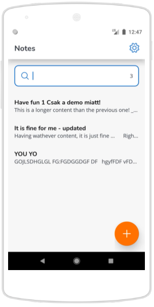
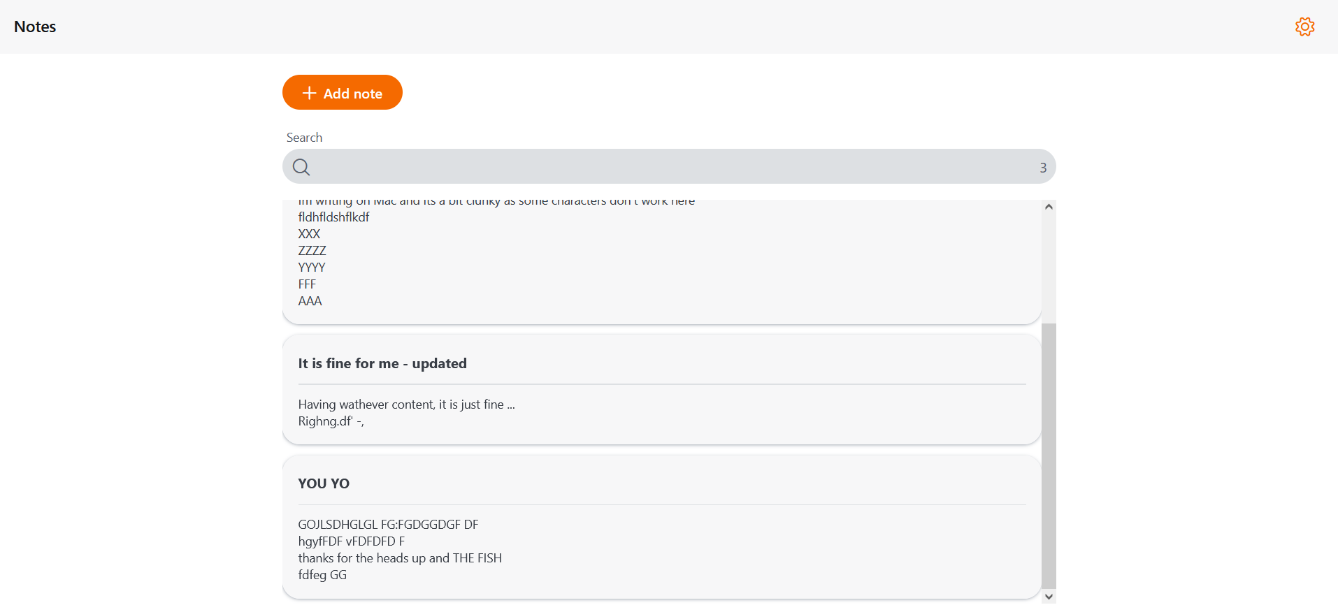
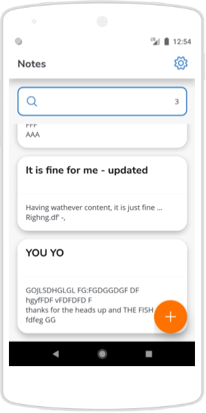
Lists
One kind of the main use cases to start the workflow on a list, where many relevant items are shown, and one can be selected for further operation. Usual requirement to have pagination and filtering. The filtering can be quick filtering on listed items or query filtering used when retrieving data from local database.
Supported list types are:
Grid list (deprecated, only supported in Webapp),
Multiline list (see details on Multiline list template lesson page),
and Card template list (see details on Card template list lesson page).
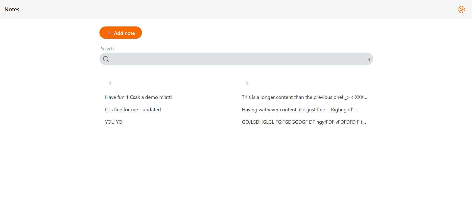
The Grid list in Webapp
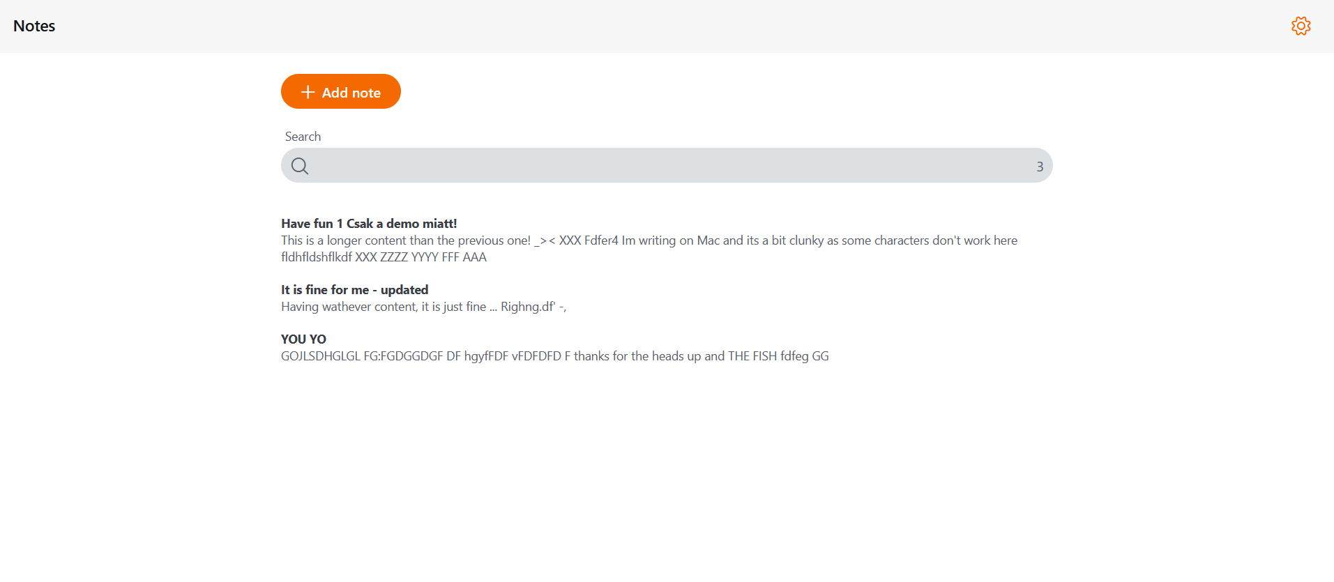
The Multiline list in Webapp
The Multiline list in mobile app
The Card template list in Webapp
The Card template list in mobile app
Input fields and Labels
The appropriate component for a user input is the inputField. An inputField can hold label and defaultText in the dictionary files, template and inputType attributes in the element definition. Details and examples can be seen in Lessons section (e.g. on Component communication page). A label component can place a text to the UI according to the project needs: defaultText in the dictionary and template in the label element definition.
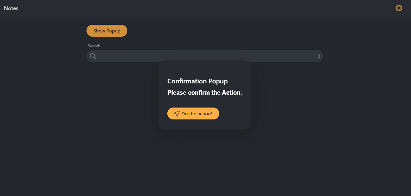
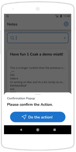
Popup windows
It is many times required to show a popup window for confirmation or other purposes. This can be done simply defining a page object where the template attribute of the element is defined as “popup”.
Popup window in Webapp with dark theme
Popup window in mobile app
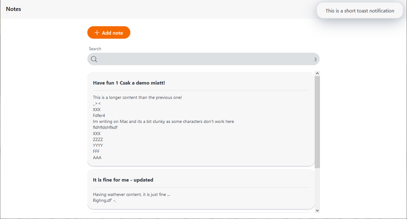
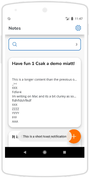
Notifications
To give UI feedback to a user action a specific UI functionality can be used: createShortToastNotificationTargetEvent().
Notification in Webapp
Notification in mobile app
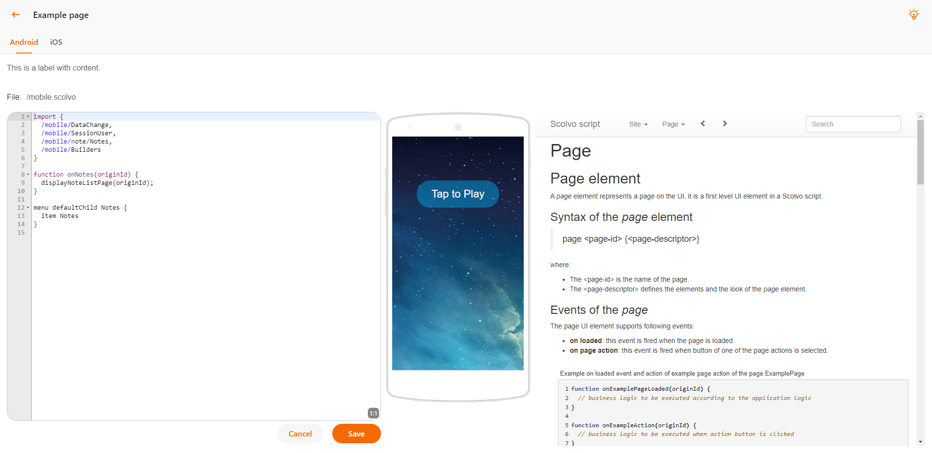
Layout elements (Containers, Tab containers, Fragment containers, IFrames, Fragments and Spacers)
To be able to group the UI elements and place them as required for the use-cases the SVM supports container supporting vertical, horizontal, buttonGroups, tabs, iFrames, and fragments (on-the-fly added component structures) and spacer elements to precisely define the distance between UI elements.
The example below contains vertical and horizontal containers, where tab containers and iFrame type containers are also used:
Containers in Webapp
 1 page ExamplePage {
 2    layout: vertical;
 3    template: fullscreen;
 4
 5    container DisclaimerContainer {
 6       layout: vertical;
 7
 8       label MessageModificationDisclaimer {
 9          template: bodyCopy1CondensedSecondary;
10       }
11    }
12
13    container InfoContainer {
14       layout: horizontalButtonGroup;
15
16       label InterpreterBuildResult {
17          template: bodyCopy1CondensedSecondary;
18       }
19    }
20
21    container Labels {
22       layout: horizontal;
23
24       label SelectedFileLabel {
25          template: bodyCopy1CondensedPrimary;
26          isBold: true;
27       }
28       spacer {
29          span: 10;
30       }
31       label SelectedFileContent {
32          template: bodyCopy1CondensedSecondary;
33       }
34    }
35
36    container CodeAndViewContainer {
37       layout: horizontal;
38       span: 0;
39
40       container CodeContainer {
41          layout: vertical;
42          span: 0;
43
44          inputField EditorContentInput {
45             inputType: codeEditor;
46             span: 0;
47          }
48
49          container ActionContainer {
50             layout: horizontalButtonGroup;
51
52             button EditorCancelButton {
53                template: secondaryMedium;
54             }
55             button EditorSaveButton {
56                template: primaryMedium;
57             }
58          }
59       }
60
61       spacer Spacer {
62          span: 20;
63       }
64
65       container ClientTabContainer {
66          layout: tab;
67          template: normal;
68       }
69
70       spacer Spacer {
71          span: 20;
72       }
73
74       container DocumentationContainer {
75          layout: vertical;
76
77          fragmentContainer DocumentationFragmentContainer {}
78       }
79    }
80 }